A shared vocabulary.
Lawrence Herbert joined Pantone in 1956, bought it in 1962 and introduced the Pantone Matching System in 1963. Hofstra biography ↗
PANTONE / A CASE STUDY IN COORDINATION
A color is a feeling. A color specification is a promise that people can work with.
How a shared reference travels from a designer’s desk to a printer, a factory and a culture—and what local makers might borrow from that idea.
Build a color handoff ↓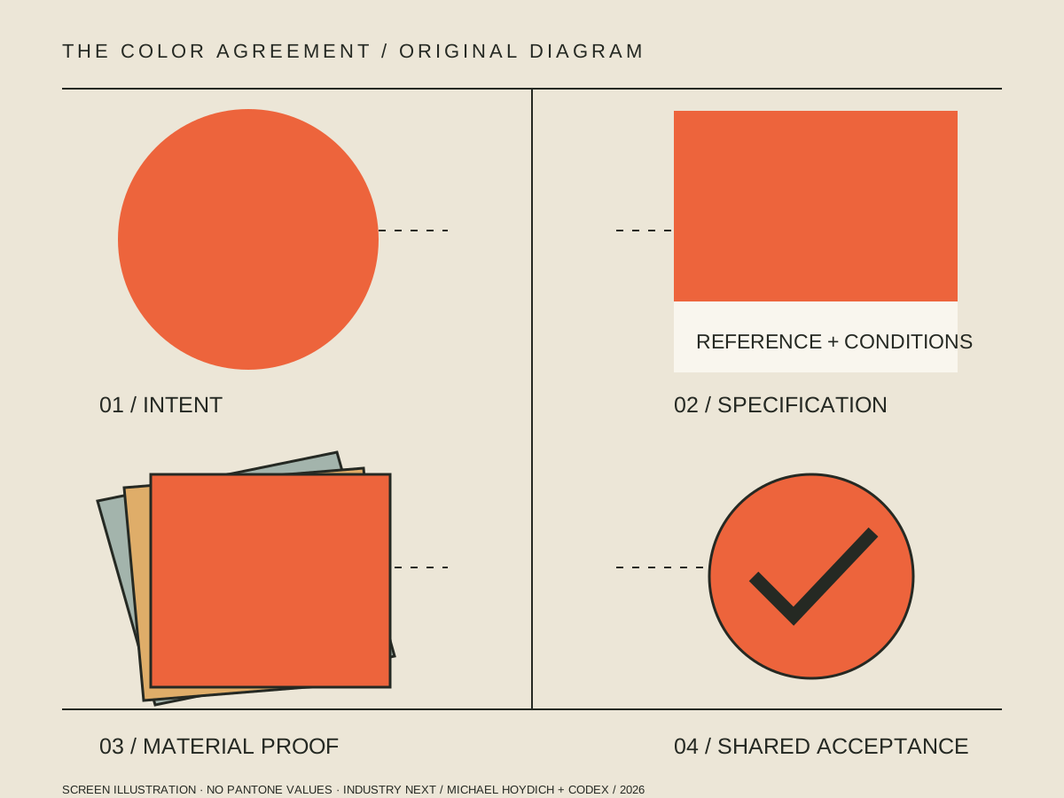
01 / TURN A JUDGMENT INTO A REFERENCE
On a call, in an email or on an uncalibrated screen, a color name leaves room for interpretation. Pantone builds tools for specifying and communicating color: physical references, digital tools and related services. Its Matching System helps people refer to a chosen color instead of relying only on a verbal description.
The useful product is the connection between a recognizable reference and a repeatable workflow. It still needs material, process and viewing conditions. A coated paper reference is not a promise that a cotton shirt, a plastic part and a phone screen will look identical. Pantone: graphic-design systems ↗
A number identifies intent. A sample, agreed conditions and a quality decision establish what a supplier should actually deliver.
Lawrence Herbert joined Pantone in 1956, bought it in 1962 and introduced the Pantone Matching System in 1963. Hofstra biography ↗
Cerulean was the first Pantone Color of the Year, for 2000. A technical reference business also became a recurring cultural story. Pantone retrospective ↗
Veralto’s current company page places X-Rite Pantone across measurement, software, standards and consulting. Checked October 25, 2026. Company source ↗
02 / THE BUSINESS LESSON
Our interpretation: the durable asset is a system people can coordinate around. These are product-design lessons, not audited Pantone revenue findings.
A small, named unit can move between departments, companies and countries. It reduces the burden of explaining the same intent from the beginning.
Local question → Can a workshop hand a supplier one understandable reference?
Physical guides, digital tools, measurement and support address different handoff problems. The reference gains value when it fits into the work people already do.
Local question → Who receives the brief, and what do they need to act?
“Close enough” needs an owner and a method. An approved sample and revision record are more useful than an attractive mockup when a batch arrives.
Local question → What evidence would let both sides agree on acceptance?
Trend narratives can start a conversation. They do not prove that a product will sell, that every culture reads a color alike, or that a press can reproduce it.
Local question → Which part is inspiration, and which part is a testable claim?
THE TRADEOFF
Pantone’s tools and services are commercial products. Access to a guide or software library does not make it an open database. A team should record which reference and version it used, confirm the rights and access needed for its workflow, and keep a supplier-approved sample.
This case study does not reproduce a proprietary color database, certify a match, or imply Pantone endorsement. Its original colors have no Pantone equivalents assigned. Pantone software-library guidance ↗
ONE INTENT / THREE DIFFERENT SYSTEMS
Compare the production questions. These simple shapes explain a process; they are not a color conversion or a simulation of a specific machine.
A separate ink is mixed and printed as a spot color. Ask for the intended reference, substrate, finish and an actual proof. A special ink may do something a process build cannot.
CMYK builds an image with cyan, magenta, yellow and black inks. Pantone’s Color Bridge compares spot references with process simulations; comparison does not make every spot color achievable.
A screen emits light. The viewing device and environment affect appearance. Use digital values for digital design and approved physical evidence for physical production.
Process guidance: Pantone guide comparison. Measurement context: X-Rite on spectrophotometers. Explore perception in the PointCast color lab ↗.
03 / THE PRODUCTION HANDOFF LAB
Choose a hypothetical job. Inspect the questions it creates. Build a downloadable discussion brief, without an account or a purchase.
Original screen illustration. No Pantone values or certified matching.
A proposed paper poster. Decide how the final stock, finish and viewing location affect the brief.
Still to describe: reference, material and process, proof and viewing conditions, approver and acceptance method.
Choices stay in this browser tab. The share link contains only exercise choices. Downloads do not send a brief or place an order.
04 / ORIGINAL PROPOSALS FOR OUR OWN RADIUS
Three possible projects for Michael Hoydich’s ecosystem. These are unlaunched concepts; no suppliers, customers, classes or results are claimed.
A public collection of consented material stories: a maker’s paper, glaze, woven cloth or painted surface. Each entry carries a photograph, date, material description and conditions of observation.
First proof: five original entries, each clearly separating the photographed appearance from a production reference.
Learn: can a reader understand what the photo cannot tell them?
A reusable template connecting original artwork, material decisions, proofs and acceptance. The useful unit is a complete job conversation, not a new proprietary color library.
First proof: walk one fictional job through the kit with two independent reviewers before proposing real production.
Learn: which missing detail causes the most rework?
A self-guided exercise: describe one color across a screen, a found object and a paper study. Note what changes, record uncertainty and build an honest specification.
First proof: an annotated comparison and a one-page maker brief, without buying a guide or ordering a product.
Learn: can another learner explain the limits of your evidence?
05 / EVIDENCE & CREDITS
Research checked October 25, 2026. Product offerings and software access can change. Brand-owner sources establish what the company says about its products; business lessons and local proposals are this publication’s analysis.
1956 role, 1962 purchase and 1963 system introduction.
References, paper and intended workflows.
Spot references and process simulations.
Retrospective published April 13, 2026, describing the 2000 selection.
Current company portfolio and stated offering.
Software-library access guidance; no price claim made.
Physical color measurement background.
Original vector diagram and geometric illustrations: Michael Hoydich + Codex, 2026. No historical photographs are fabricated; this companion uses original explanatory graphics. Historical and process imagery is credited in the PointCast core. Pantone is discussed for educational purposes; no affiliation or endorsement is asserted.